

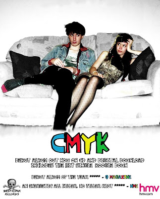
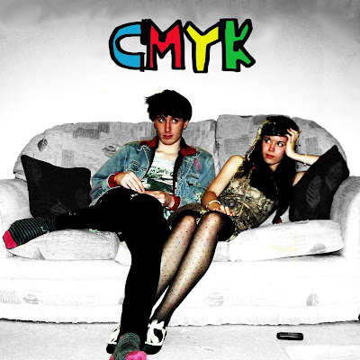
 Here is my final magazine advertisement design I made on Photoshop. I have kept it the same as my first idea as I thought it worked well and used all the conventions of magazine advertisements. I got the measurements of the poster from http://tinyurl.com/337kmdf which is the NME advertising pack which gives details of advertisement sizes and prices. I have made my poster to fit a full page which is 300x242mm and would cost £6920.
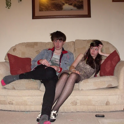 Firstly I edited the image itself by changing it to black and white. I then erased the black and white layer with the erase tool around the band so they are still in colour which makes them stand out. I used the Clone Stamp and Blur tool to get rid of the photo frames at the top of the photo to make the image look neater. Whilst editing the image I changed the saturation to make the colours brighter and the curves tool to increase the contrast so the band stood out further.
  I then added my band name and logo which is CMYK. I chose this as I still wanted a four-lettered name to follow the primary colour scheme I had and CMYK stands for the four colors (cyan, magenta, yellow and black) which are used for printing so it co-insides with the colour theme. I downloaded the font 'Yo La Tengo' from www.dafont.com. I chose this font as it looks hand drawn and childlike which represents the band as childlike and fun themselves. It also shows they don't take themselves too seriously as say an italic font would connotate.


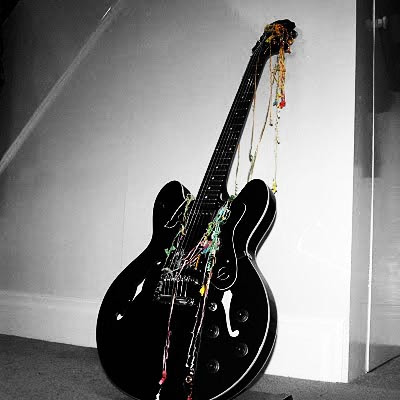
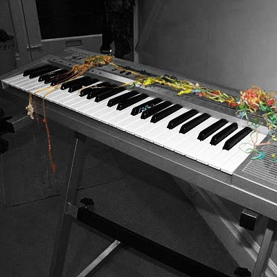


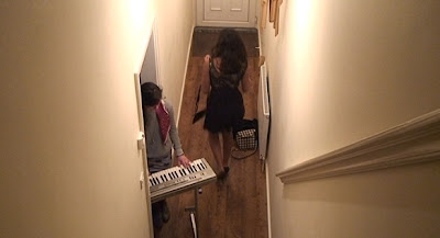
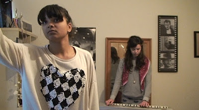
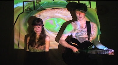
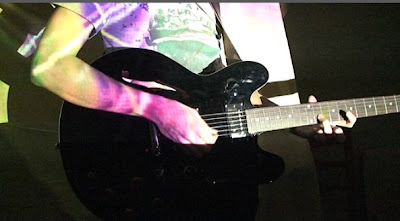
I have begun putting my footage on the editing suite and putting it together. Here are some (very) rough clips of some of my footage. I still need to edit it tighter and look at using after effects when I have filmed and uploaded all of my footage.
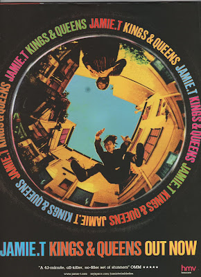
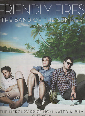 This magazine advertisement is for the self titled album by Friendly Fires, it goes againist the conventions by not showing the album cover and instead choosing a photo of the band. This advertisement represents the band as a fun summer band which is instantly connotated in the quote from The Observer. The image also shows this representation as they are dressed in summer clothes on a tropical beach. By using advertising the fact that they were Mercury Prize nominated gives the band credibility and shows that they aren't just a fun band but have acknowledged musical talent as well. This advertisement is effective at representing the band as a light and fun summer band which will appeal to a wide audience as it is music everyone can easily listen to and enjoy.
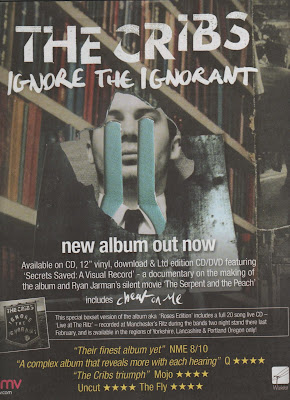 The second magazine advertisement I am analysing is for The Cribs - Ignore the Ignorant. This follows the same conventions as the last advertisement by having most of the page taken up by the main image of the album cover at the top half of the page. However this has more text and information on including the formats that the album is available on and information about a documentary included on the album. This extra information will appeal to fans as they would want to see the documentary and a wider audience would be interested as they feel they would be getting value for money. There is also another advertisement included for the special edition album with a small image of it and why it is different from the normal album. Again this extra information will appeal to existing fans but the wider audience will feel that the album must be good and credible if there is a special edition of it. More reviews are used at the bottom in a yellow text which makes it stand out from the rest of the writing and the use of more than one review shows that it is universally considered a good album, not just by one institution. Finally the HMV logo is in the bottom left corner to show where to buy it which is becoming a convention of these magazine advertisements.
 This is an effective advertisement as it uses all the conventions but I feel like there may be too much text for the audience to read if they are just glancing at it whilst turning the pages in a magazine.


-The front covers show an image of the band usually at a medium or close up shot with the name of the band shown across the top of through the middle of the image clearly displayed to the audience. The design and colour scheme are kept simple to be atheistically pleasing and to stand out to the audience. The image and design will connotate the genre of music the artist is e.g. bright colours would connotate a pop band whilst dark colours may be something like heavy metal to appeal to the target audience.
-The back cover will show details such as the record company, recording details and barcode as well as the song titles displayed in the center as the main focus. If there is an image it will be from the same photo shoot as the one on the cover or will have some connection to the cover image.
-The spine will have the name of the artist and album clearly displayed and this will be kept simple as possible so it is clear for the audience to read-The colour scheme and images on the inside will follow the same pattern as the outside covers and will usually have few or no text and simple images.
A good example of this is Oracular Spectacular by MGMT
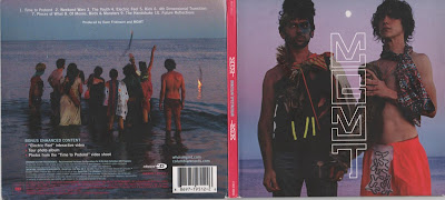


 This digipak goes against conventions of showing the artist or band on the front cover but instead shows them on the inside panel. The black and white photos connotate that the band is professional and serious about their music. Black and white photos have a 'classic' appeal and this gives the impression that The Killers are a classic and well known band. The images themselves show the band getting ready for the performance which gives the audience an intimate look at the band rather than having them posing for a pre-planned photo shoot. The black and white image theme is followed on the other inside panels which show the empty venue.
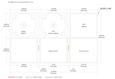 Digipaks typically consist of a book-style paperboard or card stock outer binding, with one or more plastic trays inside to hold a CD or DVD attached to the inside. This image is a six panelled digipaks with two trays for CD's or DVD's. Digipak-style cases grew in popularity among record labels and recording artists in the early 2000s and are now commonly used with new releases.
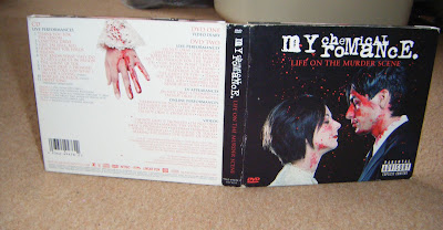
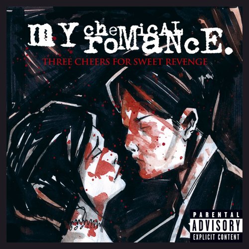
 Inside the same colour scheme of black, white and red is used for continuity. Different images of the man and woman are shown at the far sides which were also drawings from the cover of their previous album. The images on the actual CDs show the man and woman before they have been before the blood has been used whereas underneath the audience can see the same images but covered in blood. The audience can piece together their own story within these images about the characters.


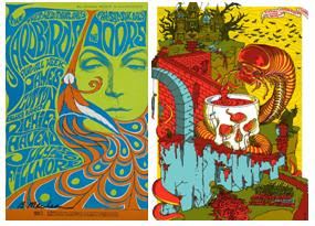
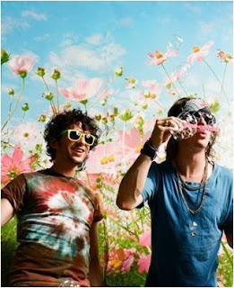
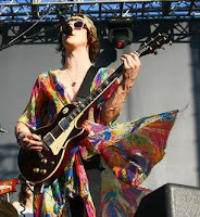 Psychedelic rock is a style of rock music that is inspired or influenced by psychedelic culture and attempts to replicate and enhance the mind-altering experiences of psychedelic drugs. It emerged during the mid 1960s among folk rock and blues-rock bands in United States and the United Kingdom. The first psychedelic rock band were 13th Floor Elevators in 1965 and the genre then went into the mainstream due to The Beatles. The genre was already growing rapidly in California some of the more famous being The Charlatans, The Doors and the Grateful Dead. MGMT have listed bands such as The Beatles and The Grateful Dead as inspirations in interviews. After the 1970’s the genre fell into decline but more recently it is being used to influence a lot of new artists and bands.