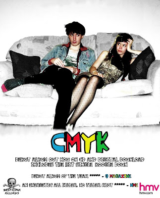
 Here is my final magazine advertisement design I made on Photoshop. I have kept it the same as my first idea as I thought it worked well and used all the conventions of magazine advertisements. I got the measurements of the poster from http://tinyurl.com/337kmdf which is the NME advertising pack which gives details of advertisement sizes and prices. I have made my poster to fit a full page which is 300x242mm and would cost £6920.
I have kept the information as simple as possible to get the message to the audience across quickly. The main focus is the band name and image which is what people will remember if they are flicking through the pages of the magazine. I have included two album reviews which shows that the album has consistently good reviews and they are from credible and well known music magazines the audience will recognise. To follow conventions I have added the record label logo and HMV logo in each corner.

No comments:
Post a Comment