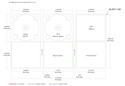
 Digipaks typically consist of a book-style paperboard or card stock outer binding, with one or more plastic trays inside to hold a CD or DVD attached to the inside. This image is a six panelled digipaks with two trays for CD's or DVD's. Digipak-style cases grew in popularity among record labels and recording artists in the early 2000s and are now commonly used with new releases.
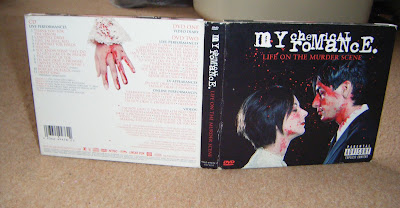
The first digipak I am analysing is Life On the Murder Scene by My Chemical Romance. Digipaks are often used for special edition CD's and DVD's and this is a good example. This contains a live performance and documentary DVD and live CD. Rather than use a photo of the band which is conventional they have used a set of images of a man and woman about to get married which is connotated through the costume of the womans white dress and mans black suit.


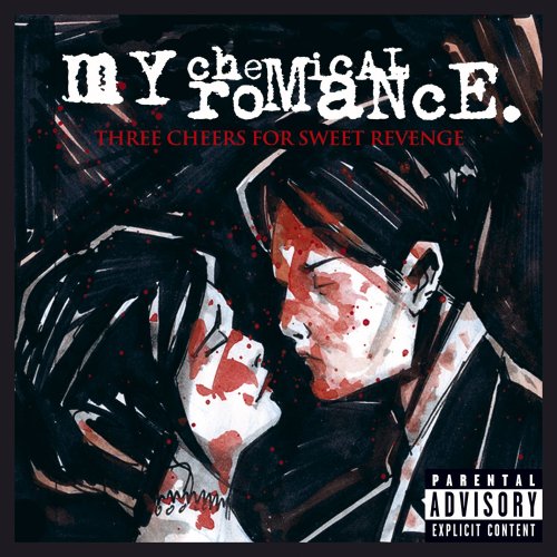
The front cover shows a couple about to kiss covered in blood as if they've just been killed. This represents the band having dark themes such as death in their music. Rather than the images being a realistic, it looks like a glamorised image of death. The audience can tell that the blood has been put specific places and the images have been carefully constructed. This is because the images are purposely identical to ones from their last album but which were drawn, as shown above. The back cover is kept simple with a white background as apposed to the black background on the rest of the album artwork. This makes the text easy to read for the audience as there is a lot of information on the back. However the dark theme is still present with the image of the woman's hand covered in blood. The logo of the band and digipak title are presented clearly across the top of the cover where it is conventional for it to be placed.
The two inside panels show extreme close ups of the bottom half of the man and woman's faces, their eyes have not been shown as this distances the audience from the characters. If their full faces were used the audience may feel emotion for them but the aim of these images are to look visually impressive and not have the audience feel sorry for them as they are just constructed images.
 Inside the same colour scheme of black, white and red is used for continuity. Different images of the man and woman are shown at the far sides which were also drawings from the cover of their previous album. The images on the actual CDs show the man and woman before they have been before the blood has been used whereas underneath the audience can see the same images but covered in blood. The audience can piece together their own story within these images about the characters.

No comments:
Post a Comment