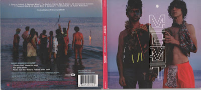
-The front covers show an image of the band usually at a medium or close up shot with the name of the band shown across the top of through the middle of the image clearly displayed to the audience. The design and colour scheme are kept simple to be atheistically pleasing and to stand out to the audience. The image and design will connotate the genre of music the artist is e.g. bright colours would connotate a pop band whilst dark colours may be something like heavy metal to appeal to the target audience.
-The back cover will show details such as the record company, recording details and barcode as well as the song titles displayed in the center as the main focus. If there is an image it will be from the same photo shoot as the one on the cover or will have some connection to the cover image.
-The spine will have the name of the artist and album clearly displayed and this will be kept simple as possible so it is clear for the audience to read-The colour scheme and images on the inside will follow the same pattern as the outside covers and will usually have few or no text and simple images.
A good example of this is Oracular Spectacular by MGMT

No comments:
Post a Comment