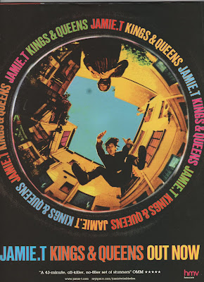
The first magazine advertisement I am analysing is for Jamie T - Kings and Queens. This advertisement is simple with the main image of the album cover taking up most of the page. This gets the album across visually straight away to the audience so if they see the album in a shop they will recognise the cover image straight away. It is also useful to attract the audiences attention with the bright coloured text standing out on the black background. The smaller text is a five star review which gives the album creditability to the audience and will persuade them to buy it. A HMV logo is in the corner as an example of where to buy the album from, HMV would of probably of paid money to have their institution advertised as first choice to buy the album. The only other text is a website and Myspace page for Jamie T so that if audiences are interested they can research him and his music further.
Overall I think this is a very effective advertisement as it successfully persuades audiences to take notice of the album without using too much text and information which may put the audience off.
 The second magazine advertisement I am analysing is for The Cribs - Ignore the Ignorant. This follows the same conventions as the last advertisement by having most of the page taken up by the main image of the album cover at the top half of the page. However this has more text and information on including the formats that the album is available on and information about a documentary included on the album. This extra information will appeal to fans as they would want to see the documentary and a wider audience would be interested as they feel they would be getting value for money. There is also another advertisement included for the special edition album with a small image of it and why it is different from the normal album. Again this extra information will appeal to existing fans but the wider audience will feel that the album must be good and credible if there is a special edition of it. More reviews are used at the bottom in a yellow text which makes it stand out from the rest of the writing and the use of more than one review shows that it is universally considered a good album, not just by one institution. Finally the HMV logo is in the bottom left corner to show where to buy it which is becoming a convention of these magazine advertisements.
 This is an effective advertisement as it uses all the conventions but I feel like there may be too much text for the audience to read if they are just glancing at it whilst turning the pages in a magazine.
No comments:
Post a Comment