Thursday, 25 November 2010

Magazine Advert Analysis and Conventions

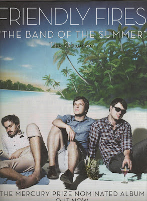
This magazine advertisement is for the self titled album by Friendly Fires, it goes againist the conventions by not showing the album cover and instead choosing a photo of the band. This advertisement represents the band as a fun summer band which is instantly connotated in the quote from The Observer. The image also shows this representation as they are dressed in summer clothes on a tropical beach. By using advertising the fact that they were Mercury Prize nominated gives the band credibility and shows that they aren't just a fun band but have acknowledged musical talent as well. This advertisement is effective at representing the band as a light and fun summer band which will appeal to a wide audience as it is music everyone can easily listen to and enjoy.


From looking at these magazine advertisement I have been able to identify the conventions -

- Large image of the album cover or sometimes the artists which takes up most of the page

- Band and album name displayed clearly above and below the image

- Quotes and ratings from established magazines for credibility

- Details of how and where to buy the album which usually includes displaying the HMV logo.
Wednesday, 24 November 2010

Magazine Advertisement Analysis


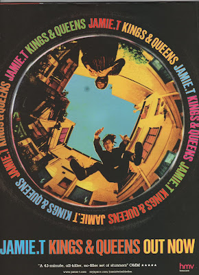
The first magazine advertisement I am analysing is for Jamie T - Kings and Queens. This advertisement is simple with the main image of the album cover taking up most of the page. This gets the album across visually straight away to the audience so if they see the album in a shop they will recognise the cover image straight away. It is also useful to attract the audiences attention with the bright coloured text standing out on the black background. The smaller text is a five star review which gives the album creditability to the audience and will persuade them to buy it. A HMV logo is in the corner as an example of where to buy the album from, HMV would of probably of paid money to have their institution advertised as first choice to buy the album. The only other text is a website and Myspace page for Jamie T so that if audiences are interested they can research him and his music further.

Overall I think this is a very effective advertisement as it successfully persuades audiences to take notice of the album without using too much text and information which may put the audience off.


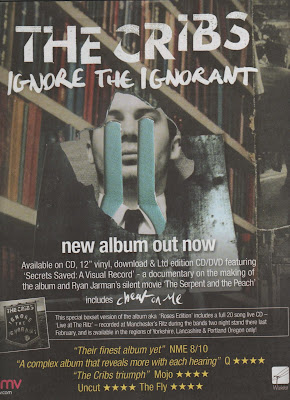
The second magazine advertisement I am analysing is for The Cribs - Ignore the Ignorant. This follows the same conventions as the last advertisement by having most of the page taken up by the main image of the album cover at the top half of the page. However this has more text and information on including the formats that the album is available on and information about a documentary included on the album. This extra information will appeal to fans as they would want to see the documentary and a wider audience would be interested as they feel they would be getting value for money. There is also another advertisement included for the special edition album with a small image of it and why it is different from the normal album. Again this extra information will appeal to existing fans but the wider audience will feel that the album must be good and credible if there is a special edition of it. More reviews are used at the bottom in a yellow text which makes it stand out from the rest of the writing and the use of more than one review shows that it is universally considered a good album, not just by one institution. Finally the HMV logo is in the bottom left corner to show where to buy it which is becoming a convention of these magazine advertisements.

This is an effective advertisement as it uses all the conventions but I feel like there may be too much text for the audience to read if they are just glancing at it whilst turning the pages in a magazine.

Saturday, 20 November 2010

Digipak ideas

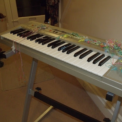
I have drawn a rough idea of how I would like my digipak to look and took the photos whilst filming the band performance scene. I want the images to represent the band as a party band rather than a 'hippie' band. The images show the band and the instruments the morning after a house party, presumably the house party in the video. When editing the photos I will be using either Photoshop at college or Photofiltre in my home computer which is very similar, I would to have the images in high contrast black and white but keep the party streamers in colour, preferably primary colours.

Thursday, 18 November 2010

Filming

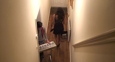
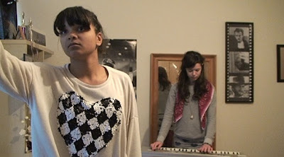
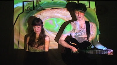
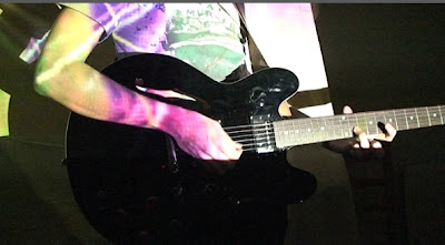
Over the past two weeks I have started filming my music video. I have now filmed all of the girls bedroom scene and the band performance scene. Whilst I organise filming the party scene I can begin to edit my music video so far. I managed to find an electric projector for the band performance scene so I could successfully project videos over the band which I think looks very effective. Here are some screenshots from what I have filmed so far, hopefully I will be able to organise and shoot the party scene in the next week or two but it will be hard organising the full cast to meet at the same time due to other priorities they have.

Wednesday, 17 November 2010

CD artwork conventions

-The front covers show an image of the band usually at a medium or close up shot with the name of the band shown across the top of through the middle of the image clearly displayed to the audience. The design and colour scheme are kept simple to be atheistically pleasing and to stand out to the audience. The image and design will connotate the genre of music the artist is e.g. bright colours would connotate a pop band whilst dark colours may be something like heavy metal to appeal to the target audience.

-The back cover will show details such as the record company, recording details and barcode as well as the song titles displayed in the center as the main focus. If there is an image it will be from the same photo shoot as the one on the cover or will have some connection to the cover image.

-The spine will have the name of the artist and album clearly displayed and this will be kept simple as possible so it is clear for the audience to read-The colour scheme and images on the inside will follow the same pattern as the outside covers and will usually have few or no text and simple images.

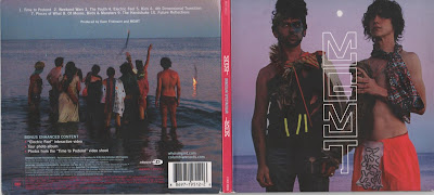
A good example of this is Oracular Spectacular by MGMT

Monday, 15 November 2010

Digipak Analysis 2

The second digipak I am analysing is a live CD and DVD by The Killers from Royal Albert Hall. The cover goes against the convention of showing the artist and instead chooses to use the venue of the live performance. The mosaic style used references the cover to their last album Day and Age (shown below) which shows the audience that they are connected. The front and back cover follow the colour scheme of silver and purple, these colours connotate royality and glamourous images. This shows that the band are well established artists and thought of highly.

This digipak goes against conventions of showing the artist or band on the front cover but instead shows them on the inside panel. The black and white photos connotate that the band is professional and serious about their music. Black and white photos have a 'classic' appeal and this gives the impression that The Killers are a classic and well known band. The images themselves show the band getting ready for the performance which gives the audience an intimate look at the band rather than having them posing for a pre-planned photo shoot. The black and white image theme is followed on the other inside panels which show the empty venue.

Thursday, 11 November 2010

Digipak Analysis

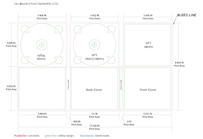
Digipaks typically consist of a book-style paperboard or card stock outer binding, with one or more plastic trays inside to hold a CD or DVD attached to the inside. This image is a six panelled digipaks with two trays for CD's or DVD's. Digipak-style cases grew in popularity among record labels and recording artists in the early 2000s and are now commonly used with new releases.

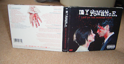
The first digipak I am analysing is Life On the Murder Scene by My Chemical Romance. Digipaks are often used for special edition CD's and DVD's and this is a good example. This contains a live performance and documentary DVD and live CD. Rather than use a photo of the band which is conventional they have used a set of images of a man and woman about to get married which is connotated through the costume of the womans white dress and mans black suit.


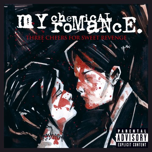
The front cover shows a couple about to kiss covered in blood as if they've just been killed. This represents the band having dark themes such as death in their music. Rather than the images being a realistic, it looks like a glamorised image of death. The audience can tell that the blood has been put specific places and the images have been carefully constructed. This is because the images are purposely identical to ones from their last album but which were drawn, as shown above. The back cover is kept simple with a white background as apposed to the black background on the rest of the album artwork. This makes the text easy to read for the audience as there is a lot of information on the back. However the dark theme is still present with the image of the woman's hand covered in blood. The logo of the band and digipak title are presented clearly across the top of the cover where it is conventional for it to be placed.

The two inside panels show extreme close ups of the bottom half of the man and woman's faces, their eyes have not been shown as this distances the audience from the characters. If their full faces were used the audience may feel emotion for them but the aim of these images are to look visually impressive and not have the audience feel sorry for them as they are just constructed images.

Inside the same colour scheme of black, white and red is used for continuity. Different images of the man and woman are shown at the far sides which were also drawings from the cover of their previous album. The images on the actual CDs show the man and woman before they have been before the blood has been used whereas underneath the audience can see the same images but covered in blood. The audience can piece together their own story within these images about the characters.

Wednesday, 10 November 2010

Locations


I have taken photos of locations used for the house party scene and the scene where the boy gets ready for the party. The pictures match up with drawings in my storyboard so I will know if the shots will work and are practical. Whilst taking these photos I learnt that unwanted things in the mise-en-scene can get into the shots very easily so I will take this into consideration when filming so that the shots do not have any unwanted objects in the background which would spoil it.

Tuesday, 9 November 2010

Genre Conventions

The band whose song I am using for my music video is MGMT who are an American band that have been described as many genres such as electronic psychedelia, new wave and experimental rock. I have narrowed all these descriptions down to psychedelic rock and this is the genre I will be focusing on and how MGMT have been influenced by the genre.

Psychedelic rock is a style of rock music that is inspired or influenced by psychedelic culture and attempts to replicate and enhance the mind-altering experiences of psychedelic drugs. It emerged during the mid 1960s among folk rock and blues-rock bands in United States and the United Kingdom. The first psychedelic rock band were 13th Floor Elevators in 1965 and the genre then went into the mainstream due to The Beatles. The genre was already growing rapidly in California some of the more famous being The Charlatans, The Doors and the Grateful Dead. MGMT have listed bands such as The Beatles and The Grateful Dead as inspirations in interviews. After the 1970’s the genre fell into decline but more recently it is being used to influence a lot of new artists and bands.

A key musical technique used is a strong reliance on keyboards and synthesizers. The first bands to use early synthesizers were The Beatles in 1967 and they are one of the most influential bands ever. Synthesizers are now extremely popular and are common place in lots of songs. MGMT use a lot of synthesizers too as it is common with psychedelic rock bands. The Beatles album ‘Sgt Pepper's Lonely Hearts Club Band’ was an encyclopedia of psychedelia and was extremely creative with unpredictable changes in rhythm, texture and melody. MGMT have stated the Beatles as major influences to them personally and the genre of music as a whole.

As a musical style psychedelic rock features electric guitars, often used with feedback, exotic instrumentation, with a particular fondness for Indian instruments such as the sitar and a strong emphasis on extended instrumental solos or jams. Lyrics are surreal, esoterically or literary-inspired. Also basic song structures aren’t often used with many songs having no set chorus and have key and time changes. All these features are found in most MGMT songs with their most obvious psychedelic track being ‘Siberian Breaks’ which uses all these common musical features.

MGMT themselves found success with their album Oracular Spectacular in 2008 which helped them become a mainstream artist. They mainly became popular because of their more pop influenced singles whilst the rest of the more experimental music on their album wasn’t as well known. This became a negative thing for the band as they gathered a lot fans who weren’t interested in their psychedelic and alternative music. The follow up album Congratulations steered away from the well known pop songs and deeper into their psychedelic influences and as a result this album has become widely successful to an alternative audience and they have seemed to of lost their mainstream following which they see a positive thing. This willingness to avoid the mainstream is a common theme for lots of alternative and psychedelic bands who would rather stick to making music they like themselves rather than write pop songs to become successful. The concept of ‘selling out’ is something these bands try to avoid as much as possible as many fans believe getting popular means a band loses their credibility.

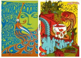
A good example of a psychedelic rock band poster and iconography of the genre in general is this poster for The Doors on the left. The picture is very surreal with an image of a large dreamlike face and what looks like a peacock tail. The text is hard to read bubble text and uses colours which conventionally aren’t used together. The right image is of an MGMT poster which also uses surreal imagery and similar bubble text. It is clear to see that MGMT have used the same surreal themes and iconography to establish themselves to their audience that they are a psychedelic rock band.

One of the most obvious traits of psychedelic rock is the influence of drugs. This is how the genre first started and one of the reasons it declined in the 1970’s is that psychedelic drugs became illegal. It is clear from interviews and song lyrics that MGMT also use these drugs as an influence, many songs being about drugs themselves such as ‘It’s Working’. Bands of the genre including MGMT have stated that drugs help them become more creative and inspired musically which is why the song structures can sometimes seem random and lyrics are surreal and sometimes have no meaning.

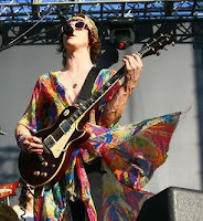
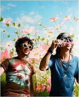
Fashion is not a main focus on psychedelic rock, as I touched on before the bands would rather focus on making music than their image. However there is a main style commonly found. The stereotypical hippie images are connected to the genre, where people generally don’t care what they look like and usually wear second hand clothes, lots of tie dye and no shoes. As the image shows MGMT have adopted this style. They more recently wear formal suits but these have obvious psychedelic imagery with bright mismatched colours and patterns.

The band steers away from modern technology in society such as Facebook which is shown through lyrics in their song ‘Flash Delirium’; ‘stab your Facebook, sell, sell, sell!’ The bands ideology and the main ideology of the genre is to get away from the trappings and distractions of contemporary society and focus on what is important. The genre is linked with hippie culture which can be seen through this ideology that material processions aren’t important. They feel that award shows and success aren’t important instead it’s about promoting this ideology and having loyal fans who share it. An example of this is the picture on the right of the band attending the Grammys which they often criticise themselves for as they felt that they didn’t fit in with the rest of the people such as Lady Gaga attending.

Psychedelic rock is a genre which tries to avoid the mainstream musically and culturally with surreal iconography and lyrics. Complex song structures and heavy use electronic and Indian instruments are put together to make a very different style of music. The genre is not just a music genre but a lifestyle choice which has a subculture of drug use primarily influencing it and it is closely linked with hippie culture.

Thursday, 4 November 2010

Shooting Script

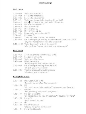
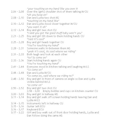
Here is my shooting script which I will be using as a checklist when filming my music video. Since from my first written storyboard the timings have changed slightly but this one is the most accurate as I timed it with the animatric.

Tuesday, 2 November 2010

Schedule

November -
1 - Shooting Script
8 - Props and Locations, shoot girls bedroom scene
15 - Shoot Band Performance scene, take CD cover shots

22 - Shoot house party scene
29 - Begin Editing, any reshooting

December -
6 - Editing Digipak and Poster
13 - Editing Digipak and Poster
20-21 - Evaluation