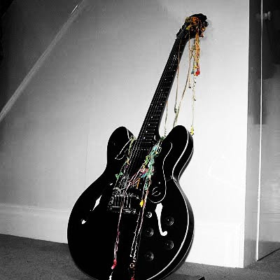
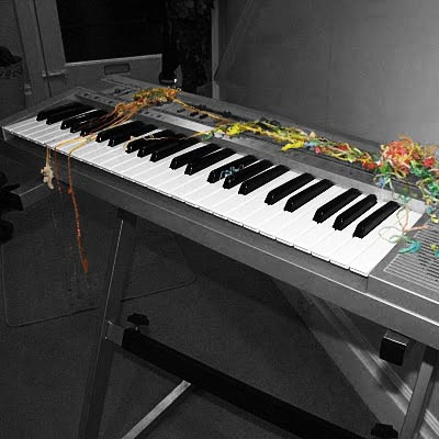
When I had finished creating my images for my digipak I put them together on the digipak template and printed it out to create my finished digipak. Here are some images of it with other CD's which shows how my digipak follows the conventions and looks like a realistic package which would fit in place on a CD shelf.
Tuesday, 21 December 2010
Saturday, 11 December 2010
Magazine Advertisement
Here is my idea and final image for my magazine advertisement. This is my first rough idea I drew. I wanted to keep the image from the digipak cover so that when the audience see the cover in the shops it will be instantly recognisable with the band. I also want to keep the same font as the digipak so again the audience will link them together. Here is my final magazine advertisement design I made on Photoshop. I have kept it the same as my first idea as I thought it worked well and used all the conventions of magazine advertisements. I got the measurements of the poster from http://tinyurl.com/337kmdf which is the NME advertising pack which gives details of advertisement sizes and prices. I have made my poster to fit a full page which is 300x242mm and would cost £6920.
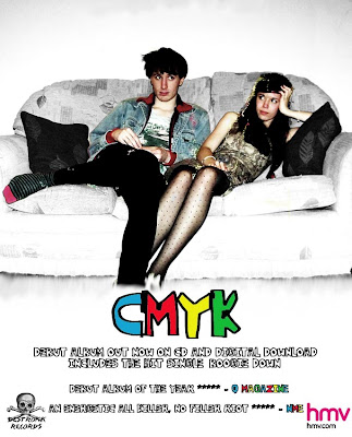
I have kept the information as simple as possible to get the message to the audience across quickly. The main focus is the band name and image which is what people will remember if they are flicking through the pages of the magazine. I have included two album reviews which shows that the album has consistently good reviews and they are from credible and well known music magazines the audience will recognise. To follow conventions I have added the record label logo and HMV logo in each corner.
Making my Digipak
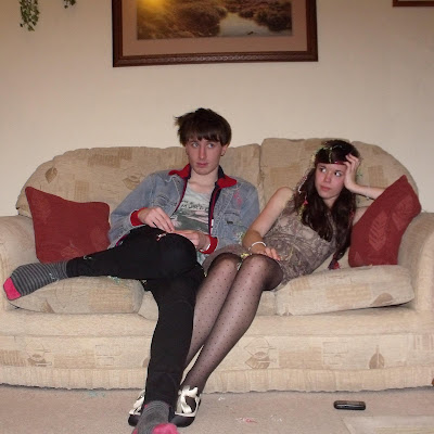
Here is my original photo which i cropped to fit the dimensions of the front cover of a CD and is ready to be edited using Photoshop.
Firstly I edited the image itself by changing it to black and white. I then erased the black and white layer with the erase tool around the band so they are still in colour which makes them stand out. I used the Clone Stamp and Blur tool to get rid of the photo frames at the top of the photo to make the image look neater. Whilst editing the image I changed the saturation to make the colours brighter and the curves tool to increase the contrast so the band stood out further.
I then added my band name and logo which is CMYK. I chose this as I still wanted a four-lettered name to follow the primary colour scheme I had and CMYK stands for the four colors (cyan, magenta, yellow and black) which are used for printing so it co-insides with the colour theme. I downloaded the font 'Yo La Tengo' from www.dafont.com. I chose this font as it looks hand drawn and childlike which represents the band as childlike and fun themselves. It also shows they don't take themselves too seriously as say an italic font would connotate.
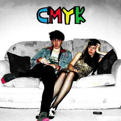
I made my back cover in the similar way by but kept the whole image black and white so the bright coloured text would stand out. To keep the digipak consistent I have used the same font and colour scheme. To follow conventions I have the track listing as the main focus and included a record company logo, bar code, websites and copyright details which make it look genuine.
I made the spines simple as possible and used parts of the same images from the front and back cover which I cropped out so that the they linked together. For the main spine I pasted a smaller version of the band logo and a quick record company logo I made myself.
I edited the two images which will be placed behind the disc in the same way as the front cover using the erase tool to keep certain parts of the image in colour. Again I used saturation and curves to improve the picture quality and make the colour further stand out.
Firstly I edited the image itself by changing it to black and white. I then erased the black and white layer with the erase tool around the band so they are still in colour which makes them stand out. I used the Clone Stamp and Blur tool to get rid of the photo frames at the top of the photo to make the image look neater. Whilst editing the image I changed the saturation to make the colours brighter and the curves tool to increase the contrast so the band stood out further.
I then added my band name and logo which is CMYK. I chose this as I still wanted a four-lettered name to follow the primary colour scheme I had and CMYK stands for the four colors (cyan, magenta, yellow and black) which are used for printing so it co-insides with the colour theme. I downloaded the font 'Yo La Tengo' from www.dafont.com. I chose this font as it looks hand drawn and childlike which represents the band as childlike and fun themselves. It also shows they don't take themselves too seriously as say an italic font would connotate.
I made my back cover in the similar way by but kept the whole image black and white so the bright coloured text would stand out. To keep the digipak consistent I have used the same font and colour scheme. To follow conventions I have the track listing as the main focus and included a record company logo, bar code, websites and copyright details which make it look genuine.
I made the spines simple as possible and used parts of the same images from the front and back cover which I cropped out so that the they linked together. For the main spine I pasted a smaller version of the band logo and a quick record company logo I made myself.
I edited the two images which will be placed behind the disc in the same way as the front cover using the erase tool to keep certain parts of the image in colour. Again I used saturation and curves to improve the picture quality and make the colour further stand out.
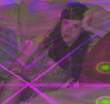
Finally I used unused front cover images which I cropped for the two other inside digipak panels. I cropped them to show each band member and I layered them over the top of conventional psychedelic imagery which connotates the genre of the band and also matches the effects used in the video.
Friday, 10 December 2010
Starting to Edit
I have begun putting my footage on the editing suite and putting it together. Here are some (very) rough clips of some of my footage. I still need to edit it tighter and look at using after effects when I have filmed and uploaded all of my footage.
Tuesday, 7 December 2010
Update
I had planned to be filming last Wednesday but due to the weather I had to cancel as college closed and my cast were unable to travel. Instead I have been concentrating on my digipak and advertisement which I should finish by the end of the week as I try to re-organise shooting. Hopefully the weather will improve so I can keep up with my schedule but my cast are hard to organise as they have a busy schedule themselves.
Subscribe to:
Posts (Atom)