Friday, 25 March 2011

Evaluation

My brief was to create a music video with two ancillary texts consisting of album artwork for a Digipak, a magazine advertisement for the Digipak or a website homepage for the band. I decided to work to my strengths of creating album artwork and a magazine advertisement as I have created posters and advertisements in the past whereas I have not had any experience with web design.

I have used conventions of music videos so the text is recognisable to the audience as a music video. The first of which I used is close-ups within the cinematography. These are used to highlight the artist so the audience can remember their face and appearance. However I didn’t use that many close-ups and stuck to using medium shots of both band members together. I did this so the audience can focus on both members of the band equally as I did not want to create a video which features one band member more than another. Some may say showing close-ups of the lead singer is a convention of a music video as they are the main image of the band, I challenged this by showing them both together most of the time.

Editing is very important in music video as another convention of them is that it must be edited on the beat. Also it must match the pace of the song for example fast editing to a fast song. I feel that I did this effectively with longer edits for more relaxed instruments parts of the song such as the beginning and end. For parts such as the guitar solos I used fast paced editing to enhance that part of the song and I feel that I used this well during the guitar solos. I also synched the song to the lyrics and instruments and played certain shots such as someone clapping over the sound of clapping. Another example of this is when two glasses come together a cymbal is heard. This adds an extra link the song and video.

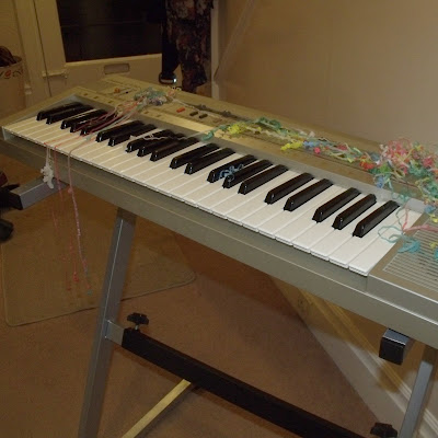
The lyrics must link to the visuals of the song and I did this literally by showing certain key lyrics on the screen. The song is also about a party so I used images which connotates parties such as glasses of alcohol, party poppers and feet dancing. The theme of parties is also used in the ancillary texts with party popper streamers over the band in the band photo and their instruments seen in the Digipak artwork.

Music videos are postmodern texts and I feature of post modernity is non linear narratives which I have used in my music video. Sven Carlson (1999) suggests that music videos can fall into the groups of performance, abstract or narrative. At first I planned to make a video with narrative but realised that my idea of a house party was not possible as I became unhappy with the narrative as a whole as I felt like not much was happening. I found it hard making a narrative for the music video as it is so short that there is no time for any character development. Also the objective of the music video is to focus on the artist itself and I was spending too much time thinking about changing my narrative, so I decided to make a mainly performance video. It also has aspects of abstract videos with the clips which connotate parties. Abstract videos use the stylistics to show the meaning of the song and can sometime be used to simply look good rather than fit any context. I wanted to keep everything I did to the theme of the song and made sure I could reference the song and its themes within all the shots I used. Some of these are sued literally with shot of people holding hands to the line ‘touching my hand’ and someone putting on sunglasses to ‘it’s cool’.

Michael Shore (1998) argues that music videos are surface without substance based on immediate gratification. To an extent this is true as they are meant to market the song and band to an audience within an average of four minutes. To do this they must be instantly aesthetically pleasing for it to have an impact on contemporary active audiences. I feel like I grabbed the audience’s attention by showing the lyrics onscreen using bright primary colours, this also matches the name and logo of the band CMYK. CMYK stands for cyan, magenta, yellow and black which are the colours used for printing. Because of this the use of strong colours was a motif I have been using when creating all my products.

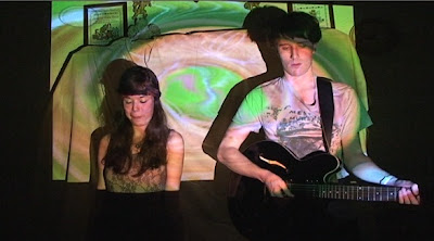
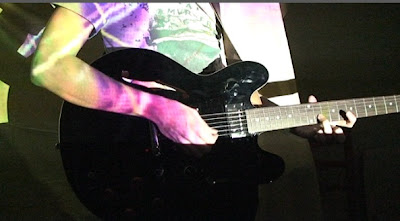
The genre of the band MGMT whose song I have used is psychedelic rock although the song Boogie Down on its own is more pop and electronic than their other songs. I have still used psychedelic imagery in the video such as the background projections onto the bands face, the bright and random images used for the green screen shots and the images which are filtered over the top of the other party shots. This makes still makes it recognisable as psychedelic rock even if the song in particular isn’t, the band are still represented correctly.

However to suit the song I looked at the party lifestyle associated with the band rather than their ties to hippie culture and ideology. This is clearly shown through the shots of alcohol and party poppers to connotate parties, this party band representation also matches the lyrics of the song.

As my video focuses on the party lifestyle of the band it more likely to appeal to and represent young adults and students aged from sixteen to early twenties. I have chosen specifically students as they typically known for going out a lot with of friends and having fun which is what my chosen song is about. The video and ancillary texts will appeal to them as it expresses their party lifestyle or the lifestyle they wish to lead. This leads to the voyeuristic nature of the music video, the audience will be attracted to the artist if they want to become the artist and live their lifestyle. The target audience is both male and female and there is a male and female member of the band for each group to identify themselves with.

The girl is wearing a pretty and feminine outfit and has long hair which adds to her feminine appearance. But whereas most girls in bands are simply the singer she plays an instrument herself which gives her credibility to the audience. This shows her as pretty and also smart which would appeal to girls and boys. Being in a band that are represented with a party lifestyle shows likes to have fun and being in a band with a male shows she is not a traditional female and can have fun being around males as the traditional male stereotype does. This shows she is independent and strong. Altogether she is represented as a modern female who is not just seen as the ‘pretty face’ of the band. The boy is wearing casual clothes which make him look down to earth and he is also wearing a Smiths T-shirt. This shows he likes highly regarded bands such as The Smiths which shows he has good music taste from an audience’s point of view. From the outfit he looks like someone who is approachable and has good knowledge of music. Throughout the video he often looks bored which connotates a ‘too cool to care’ attitude. Overall the band are represented in a way which would appeal to my target audience as they are interested in the ‘rock star’ lifestyle of playing music and going out.

For my planning and research I analysed three different music videos. Firstly I analysed ‘Look for the Woman’ by Dan le Sac vs Scroobius Pip, which is a narrative video. I liked the idea of the artist following the characters in the video around and this was part of my first video idea. However I had to change my idea as I was unable to get my cast together at the same time so had to go for a simpler idea. The other two videos were by MGMT and this established the psychedelic imagery and surreal themes they use in their videos. I incorporated this into my own videos with the band performance scene.

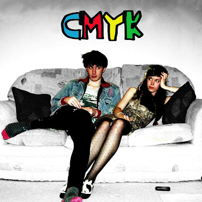
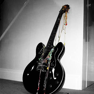
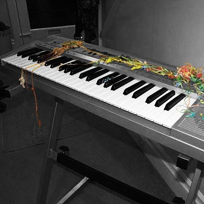
When creating my Digipak I looked at the conventions of Digipak and CD’s such as were the barcodes are placed and what the main images look like by analysing existing Digipaks, using a range of music genres such as My Chemical Romance and The Killers. For my CD artwork I took pictures of the bands and their instruments covered in party poppers to give the impression of a party. Empty bottles of alcohol were used to frame the song titles on the back cover which gives the impression that it is the morning after a party. The band are also covered in party poppers which connotates that they were at the party the night before. When editing the photos I changed everything to black and white apart from the band so that they stand out. I also found a font from 'Yo La Tengo' from http://www.dafont.com/. I chose this font as it looks hand drawn and childlike which represents the band as childlike and fun themselves. It also shows they don't take themselves too seriously as say an italic font would connotate. This is also conveyed by the bright colours which are used throughout the ancillary texts and music video.

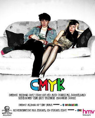
For the magazine advertisement I again analysed existing texts to make my own look believable, I did this by including the record company logo and HMV logo in the bottom corners. I used the same picture which I used for the Digipak cover so that the two products are instantly recognisable as being part of the same promotional campaign. I kept it simple by focusing on the image and including small captions of reviews from well known magazines underneath.

My magazine advertisement, Digipak and music video all use the same motif of bright coloured text which relate them all together. They all show the band wearing the same outfits so they are easily recognisable in all of my media texts. Overall I feel that they all link together very effectively to form a strong image for the promotional campaign. In my audience feedback 60% of the twenty people I asked rated the effectiveness of all the products as a whole 4 out of 5. 20% rated it 3 out of 5 and the remaining 20% rated it 5 out of 5.

For my audience feedback I gave a short page long questionnaire to a class of twenty AS students. My audience were between 16 and 19 and this age group would typically be interested in social events, music and parties and they would have some disposable income which would be spent on these. I gave them the questionnaire and music video link through the teacher so I had no contact with them so there would be no bias in the answers. Therefore I feel like I have valid results from which I can determine the audience reaction to my music video. For the question ‘How effective do you find the onscreen text?’ 45% rated it 3 out of 5 and 45% rated it 4 out of 5. Out of the remaining students 5% rated it 2 and 5% gave it 5 out of 5. I am happy with result and believe the text connects the song and video and splits up some of the band performance scenes. I left a space at the bottom of the page for any additional comments and here someone wrote ‘I think that the effects with the bright coloured writing worked well’.

For the question ‘How effective do you find the green screen clips and other clips?’ 50% rated 3 our of 5, 33% rated it 4, 15% rated 2 and 5% rated 5 out of 5. Again I am happy with this as everyone rated it 3 or above apart from one person. If I were to do this again I would film more short clips as I found I had to repeat some towards the end of the video which may of caused some people to rate it lower. Someone wrote ‘Too much going on at once’, this could mean that they found that I have too many different clips or that the images over the top of the clips made the screen too busy. Another person answered ‘some stop motion fell short however the editing was in sync and the images were relevant and interesting.’ I think the stop motion they mentioned would have been when the glass of alcohol was being drained and refilled, when doing this the camera moved so that the last half of the shots were on a slant. However I did not notice this until I put it on the editing suite and it was too late. If I were to do this again I would check my footage more closely after filming so I would not have to think about any re-shoots. However on the questionnaire they gave a positive response to my music video.

The next question was ‘Overall do you think the video enhanced the song?’ 45% of the students rated 3 out of 5, 33% rated it 4, 15% rated it 5 and 10% rated it 2 out of 5. Here I felt that these results could have been improved if I had spent more time with the actors I used when planning the video so they could sing the lyrics. At times in the video it is obvious that they are not singing as they cannot remember the words. This problem is made apparent with the feedback from the question ‘How effective do you find the band performance scene?’ 50% rated it 2 out of 5, 25% rated it 3, 10% rated 4 and 5% rated 5 out of 5. As I mentioned I feel like the main problem with this is the actors. I am happy with the projected images and felt that they were effective, but the fact that the actors did not know the words brought it down. Another factor could be that for the majority of the video it was one shot, if there was more close ups it could of improved the band performance scenes by keeping it more interesting. You could of also seen the psychedelic imagery over their faces clearer which would of made them more effective.

On the other hand for the question ‘Do you think this appeals to your age group (16-19)?’ 70% rated it 4 out of 5, 15% 3 out of 5 and 15% 2 out of 5. This means my video has reached its target audience of young adults which I tried to achieve using the bright colours to grab their attention and party imagery. The party lifestyle appeals to the stereotypical young adult which is one reason why I used it and I feel that it has achieved its purpose well. From the audience feedback I found the weak point of my video was the band performance scene and the strong point was the editing which I received positive comments at the end on including ‘good camera editing’ and ‘it was timed very well’.

When planning my music video I uploaded all my drafts and storyboards onto www.blogger.com. This helped me see everything I had done so I could see what I had to do next, it was also easy to let other people see my work as I could just give them the URL. When filming I used a HD camera so that I would have high quality images which made the projected images on the band performance scene stand out more. HD cameras are suitable in lower light situations so was useful for this scene. Overall the images were high resolution and crisper video images than non-HD cameras. I used an electronic projector to project the images onto the band directly from my computer. I did this instead of using the imagery as a filter in post production so the audience can see the patterns moving around the faces of the band. I also used the green screen room for certain small clips as I could put bright images behind, this goes with the imagery used in the band performance scene so it does not look out of place.

When editing I used Adobe Premier Pro so I could use non-linear editing. This allowed me to take different clips and paste them on a timeline wherever I wanted them and could easily crop them down. I could start editing the video wherever I wanted to on the timeline and didn’t have to start at the beginning, this let me go back and forth making changes to my video without having to start from the beginning again. I could also extend or cut clips just by dragging the mouse and pulling the clip left or right. This again made it much easier and quicker to edit and I could go through my video making small changes when I watched it back. I started by picking sections from the band performance scene and fitting them into the correct parts of the song so the lip syncing was correct. I did this by listening to the sound on the original clip and matching it up with the song. It could sometimes take a few times to get it right but through trial and error I managed to sync the lips to the song. I then put in the words which flash up onscreen on the timeline which again would match the timing of the song. Finally I added the different short clips in the spaces left and made sure that the editing was on the beat.

When creating my Digipak and magazine advertisement I used Adobe Photoshop, this let me easily change things such as the contrast and brightness of the photos. I used the curves tool to increase the contrast further. Photoshop also lets me have each image in layers so I can move around the barcode or text without moving the rest of the image. I could use the clone stamp to get rid of unwanted things in the picture such as the photo frame at the top. For the inside artwork I cropped the picture of the band so each member is at a medium shot and placed more psychedelic imagery over the top. I edited the magazine advertisement in the same way but added reviews of the album to make it a conventional magazine advertisement.

In conclusion I feel like I have made an effective promotional campaign and that the music video clearly represents the band and their ideology. It also appeals to my target audience of young adults. If I were to do the music video again I would take longer filming the band performance scene and shoot more close ups of the band so the projector images have a bigger impact.

Thursday, 17 March 2011

Audience Feedback Results

I gave my questionnaire and blog address to a class of 20 AS students. From this I worked out the results :-

How effective do you find the band performance scene?
50% of the students graded it 2 out of 5, 25% said 3, 10% said 4, 5% said 5


How effective do you find the onscreen text?
5% said 2, 45% said 3, 45% said 4, 5% said 5


How effective do you find the green screen clips and other clips?
15% said 2, 50% said 3, 33% said 4, 5% said 5


Overall do you think the video enhanced the song?
10% said 2, 45% said 3, 33% said 4, 15% said 5


Do you think the video appeals to your age group (16-19)?
15% said 2, 15% said 3, 70% said 4


How effective is the video, magazine advert and CD artwork as a whole?
20% said 3, 60% said 4, 20% said 5

Monday, 14 March 2011

Final Music Video

Today I have finished and uploaded my final music video to Youtube. I have used all my footage and kept repeating the same shots to a minimum so it is mainly unnoticable. I have also put coloured filters over the top of certain shots so they match the imagery of the projections in the band performance scene.

Tuesday, 8 March 2011

Audience Feedback

Whilst I have been finishing my editing I have also been making a short audience feedback questionnaire. I am planning to give this to an AS class along with the video and ancillary texts. By giving this to people I don't know it gets rid of the bias of giving it to friends to watch so will provide more valid data. From this I can complete my evaluation and analyse what was and wasn't effective with my music video and if it is recognisable with the ancillary texts.

Also I am hoping to post my final edit of the music video up early next week.


Friday, 18 February 2011

Filming and Editing

Over the past few weeks I have filmed different small clips to use in my music video. I have now begun to edit my music video and put these clips in. Here is the first 2 minutes or so of my video, there is a blank space in the middle which I haven't edited yet.


watching this back I realise some clips need to be edited at the end and the party popper clip could be played in slow motion so you actually see it explode which was the desired effect. I am mostly happy with the pace of editing as it follows the beat of the song which is a convention of a music video.

Monday, 31 January 2011

Filming Update

This week I have been filming the new parts to my music video, these have been much easier to organise than my last idea which led to me changing it. I hav used a minimum cast infront of a green scren at college so no on has to go out of their way to be in the video. Green screen also allows me to pay with the background and allow me to use different images and videos behind the footage. At the moment am thinking of pictures of bright lights and fireworks to go with the bright colours which I will using for the rest of the video

Tuesday, 18 January 2011

New Idea

I have made a list of possible clips that i need to film and put into my music video. Each one should only be a few seconds long. I have tried to keep them within the theme of a party with clips of dancing and drinking. The ones with dots next to them may need to be filmed in the green screen room so they have an effective background rather than just a plain wall. I have also wrote down the lyrics which will appear on screen and when they appear in the song.

Sunday, 16 January 2011

Change of Plan

Filming the party scene is going to be difficult as I have to get all my cast together at the same time. I am also becoming unhappy with the narrative the more I look into filming and the editing I have so far seems too slow.

I have decided to change the video so it does not have a clear narrative and is instead a range of different clips, some having to do with the lyrics. I still want to use the outline of the narrative of a boy and girl becoming a couple but will show them together through different shots throughout the video. Other shots can include party poppers going off and small party scenes. This idea will keep the editing quicker which is a convention of music videos. Another idea is having key words in the lyrics flashing up on the screen for a few seconds.

I am keeping my already filmed band performance scene which I will keep cutting to throughout the video as the main focus so the video isn't made up of random clips and has consistency

Tuesday, 21 December 2010

Finished Digipak

When I had finished creating my images for my digipak I put them together on the digipak template and printed it out to create my finished digipak. Here are some images of it with other CD's which shows how my digipak follows the conventions and looks like a realistic package which would fit in place on a CD shelf.


Saturday, 11 December 2010

Magazine Advertisement

Here is my idea and final image for my magazine advertisement. This is my first rough idea I drew. I wanted to keep the image from the digipak cover so that when the audience see the cover in the shops it will be instantly recognisable with the band. I also want to keep the same font as the digipak so again the audience will link them together. Here is my final magazine advertisement design I made on Photoshop. I have kept it the same as my first idea as I thought it worked well and used all the conventions of magazine advertisements. I got the measurements of the poster from http://tinyurl.com/337kmdf which is the NME advertising pack which gives details of advertisement sizes and prices. I have made my poster to fit a full page which is 300x242mm and would cost £6920.

I have kept the information as simple as possible to get the message to the audience across quickly. The main focus is the band name and image which is what people will remember if they are flicking through the pages of the magazine. I have included two album reviews which shows that the album has consistently good reviews and they are from credible and well known music magazines the audience will recognise. To follow conventions I have added the record label logo and HMV logo in each corner.


Making my Digipak

Here is my original photo which i cropped to fit the dimensions of the front cover of a CD and is ready to be edited using Photoshop.

Firstly I edited the image itself by changing it to black and white. I then erased the black and white layer with the erase tool around the band so they are still in colour which makes them stand out. I used the Clone Stamp and Blur tool to get rid of the photo frames at the top of the photo to make the image look neater. Whilst editing the image I changed the saturation to make the colours brighter and the curves tool to increase the contrast so the band stood out further.

I then added my band name and logo which is CMYK. I chose this as I still wanted a four-lettered name to follow the primary colour scheme I had and CMYK stands for the four colors (cyan, magenta, yellow and black) which are used for printing so it co-insides with the colour theme. I downloaded the font 'Yo La Tengo' from www.dafont.com. I chose this font as it looks hand drawn and childlike which represents the band as childlike and fun themselves. It also shows they don't take themselves too seriously as say an italic font would connotate.


I made my back cover in the similar way by but kept the whole image black and white so the bright coloured text would stand out. To keep the digipak consistent I have used the same font and colour scheme. To follow conventions I have the track listing as the main focus and included a record company logo, bar code, websites and copyright details which make it look genuine.


I made the spines simple as possible and used parts of the same images from the front and back cover which I cropped out so that the they linked together. For the main spine I pasted a smaller version of the band logo and a quick record company logo I made myself.


I edited the two images which will be placed behind the disc in the same way as the front cover using the erase tool to keep certain parts of the image in colour. Again I used saturation and curves to improve the picture quality and make the colour further stand out.


Finally I used unused front cover images which I cropped for the two other inside digipak panels. I cropped them to show each band member and I layered them over the top of conventional psychedelic imagery which connotates the genre of the band and also matches the effects used in the video.

Friday, 10 December 2010

Starting to Edit

I have begun putting my footage on the editing suite and putting it together. Here are some (very) rough clips of some of my footage. I still need to edit it tighter and look at using after effects when I have filmed and uploaded all of my footage.


Tuesday, 7 December 2010

Update

I had planned to be filming last Wednesday but due to the weather I had to cancel as college closed and my cast were unable to travel. Instead I have been concentrating on my digipak and advertisement which I should finish by the end of the week as I try to re-organise shooting. Hopefully the weather will improve so I can keep up with my schedule but my cast are hard to organise as they have a busy schedule themselves.

Thursday, 25 November 2010

Magazine Advert Analysis and Conventions

This magazine advertisement is for the self titled album by Friendly Fires, it goes againist the conventions by not showing the album cover and instead choosing a photo of the band. This advertisement represents the band as a fun summer band which is instantly connotated in the quote from The Observer. The image also shows this representation as they are dressed in summer clothes on a tropical beach. By using advertising the fact that they were Mercury Prize nominated gives the band credibility and shows that they aren't just a fun band but have acknowledged musical talent as well. This advertisement is effective at representing the band as a light and fun summer band which will appeal to a wide audience as it is music everyone can easily listen to and enjoy.


From looking at these magazine advertisement I have been able to identify the conventions -

- Large image of the album cover or sometimes the artists which takes up most of the page

- Band and album name displayed clearly above and below the image

- Quotes and ratings from established magazines for credibility

- Details of how and where to buy the album which usually includes displaying the HMV logo.

Wednesday, 24 November 2010

Magazine Advertisement Analysis


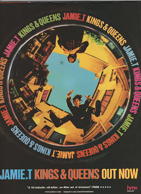
The first magazine advertisement I am analysing is for Jamie T - Kings and Queens. This advertisement is simple with the main image of the album cover taking up most of the page. This gets the album across visually straight away to the audience so if they see the album in a shop they will recognise the cover image straight away. It is also useful to attract the audiences attention with the bright coloured text standing out on the black background. The smaller text is a five star review which gives the album creditability to the audience and will persuade them to buy it. A HMV logo is in the corner as an example of where to buy the album from, HMV would of probably of paid money to have their institution advertised as first choice to buy the album. The only other text is a website and Myspace page for Jamie T so that if audiences are interested they can research him and his music further.

Overall I think this is a very effective advertisement as it successfully persuades audiences to take notice of the album without using too much text and information which may put the audience off.


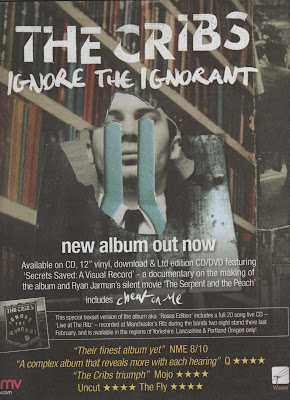
The second magazine advertisement I am analysing is for The Cribs - Ignore the Ignorant. This follows the same conventions as the last advertisement by having most of the page taken up by the main image of the album cover at the top half of the page. However this has more text and information on including the formats that the album is available on and information about a documentary included on the album. This extra information will appeal to fans as they would want to see the documentary and a wider audience would be interested as they feel they would be getting value for money. There is also another advertisement included for the special edition album with a small image of it and why it is different from the normal album. Again this extra information will appeal to existing fans but the wider audience will feel that the album must be good and credible if there is a special edition of it. More reviews are used at the bottom in a yellow text which makes it stand out from the rest of the writing and the use of more than one review shows that it is universally considered a good album, not just by one institution. Finally the HMV logo is in the bottom left corner to show where to buy it which is becoming a convention of these magazine advertisements.

This is an effective advertisement as it uses all the conventions but I feel like there may be too much text for the audience to read if they are just glancing at it whilst turning the pages in a magazine.

Saturday, 20 November 2010

Digipak ideas

I have drawn a rough idea of how I would like my digipak to look and took the photos whilst filming the band performance scene. I want the images to represent the band as a party band rather than a 'hippie' band. The images show the band and the instruments the morning after a house party, presumably the house party in the video. When editing the photos I will be using either Photoshop at college or Photofiltre in my home computer which is very similar, I would to have the images in high contrast black and white but keep the party streamers in colour, preferably primary colours.

Thursday, 18 November 2010

Filming

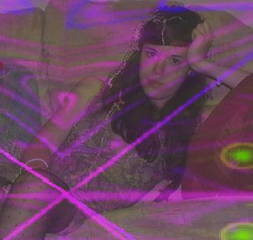
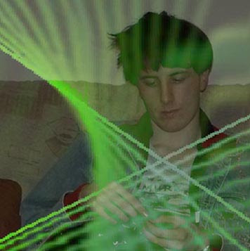
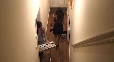
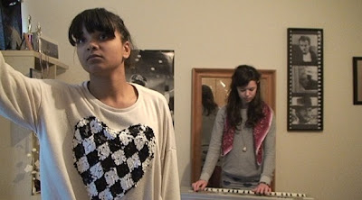
Over the past two weeks I have started filming my music video. I have now filmed all of the girls bedroom scene and the band performance scene. Whilst I organise filming the party scene I can begin to edit my music video so far. I managed to find an electric projector for the band performance scene so I could successfully project videos over the band which I think looks very effective. Here are some screenshots from what I have filmed so far, hopefully I will be able to organise and shoot the party scene in the next week or two but it will be hard organising the full cast to meet at the same time due to other priorities they have.

Wednesday, 17 November 2010

CD artwork conventions

-The front covers show an image of the band usually at a medium or close up shot with the name of the band shown across the top of through the middle of the image clearly displayed to the audience. The design and colour scheme are kept simple to be atheistically pleasing and to stand out to the audience. The image and design will connotate the genre of music the artist is e.g. bright colours would connotate a pop band whilst dark colours may be something like heavy metal to appeal to the target audience.

-The back cover will show details such as the record company, recording details and barcode as well as the song titles displayed in the center as the main focus. If there is an image it will be from the same photo shoot as the one on the cover or will have some connection to the cover image.

-The spine will have the name of the artist and album clearly displayed and this will be kept simple as possible so it is clear for the audience to read-The colour scheme and images on the inside will follow the same pattern as the outside covers and will usually have few or no text and simple images.

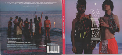
A good example of this is Oracular Spectacular by MGMT

Monday, 15 November 2010

Digipak Analysis 2

The second digipak I am analysing is a live CD and DVD by The Killers from Royal Albert Hall. The cover goes against the convention of showing the artist and instead chooses to use the venue of the live performance. The mosaic style used references the cover to their last album Day and Age (shown below) which shows the audience that they are connected. The front and back cover follow the colour scheme of silver and purple, these colours connotate royality and glamourous images. This shows that the band are well established artists and thought of highly.

This digipak goes against conventions of showing the artist or band on the front cover but instead shows them on the inside panel. The black and white photos connotate that the band is professional and serious about their music. Black and white photos have a 'classic' appeal and this gives the impression that The Killers are a classic and well known band. The images themselves show the band getting ready for the performance which gives the audience an intimate look at the band rather than having them posing for a pre-planned photo shoot. The black and white image theme is followed on the other inside panels which show the empty venue.

Thursday, 11 November 2010

Digipak Analysis

Digipaks typically consist of a book-style paperboard or card stock outer binding, with one or more plastic trays inside to hold a CD or DVD attached to the inside. This image is a six panelled digipaks with two trays for CD's or DVD's. Digipak-style cases grew in popularity among record labels and recording artists in the early 2000s and are now commonly used with new releases.

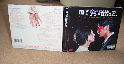
The first digipak I am analysing is Life On the Murder Scene by My Chemical Romance. Digipaks are often used for special edition CD's and DVD's and this is a good example. This contains a live performance and documentary DVD and live CD. Rather than use a photo of the band which is conventional they have used a set of images of a man and woman about to get married which is connotated through the costume of the womans white dress and mans black suit.


The front cover shows a couple about to kiss covered in blood as if they've just been killed. This represents the band having dark themes such as death in their music. Rather than the images being a realistic, it looks like a glamorised image of death. The audience can tell that the blood has been put specific places and the images have been carefully constructed. This is because the images are purposely identical to ones from their last album but which were drawn, as shown above. The back cover is kept simple with a white background as apposed to the black background on the rest of the album artwork. This makes the text easy to read for the audience as there is a lot of information on the back. However the dark theme is still present with the image of the woman's hand covered in blood. The logo of the band and digipak title are presented clearly across the top of the cover where it is conventional for it to be placed.

The two inside panels show extreme close ups of the bottom half of the man and woman's faces, their eyes have not been shown as this distances the audience from the characters. If their full faces were used the audience may feel emotion for them but the aim of these images are to look visually impressive and not have the audience feel sorry for them as they are just constructed images.

Inside the same colour scheme of black, white and red is used for continuity. Different images of the man and woman are shown at the far sides which were also drawings from the cover of their previous album. The images on the actual CDs show the man and woman before they have been before the blood has been used whereas underneath the audience can see the same images but covered in blood. The audience can piece together their own story within these images about the characters.